Why this menu holder earns its place
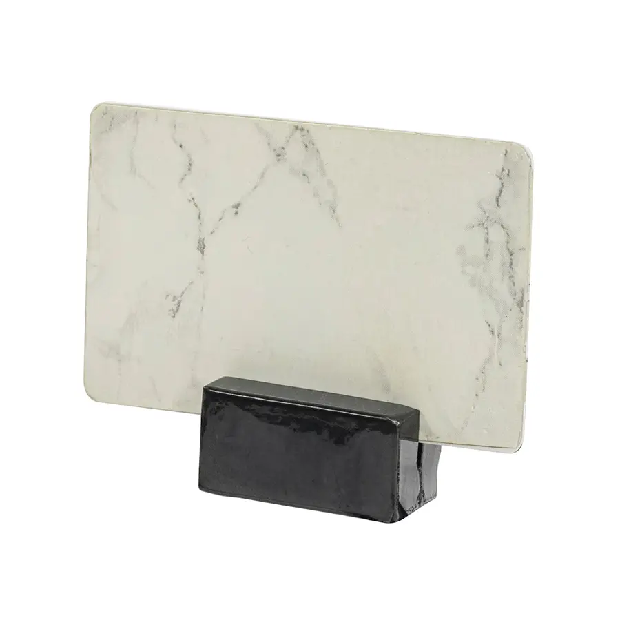
A dining room runs on small pieces of printed card — table numbers for the runners, reserved cards on booked covers, allergen and specials notes, labels down a buffet line. This is the block that stands one of them up and keeps it there. It is compact and plain by design, because a card holder that draws attention to itself is competing with the thing it is supposed to be presenting.
Being heavy is what makes it work through a service. Light holders slide when a cloth is pulled through a table, skate when a tray comes down beside them, and tip in the draught off a door — and every one of those means someone stopping mid-service to re-stand a card. Mass fixes it. The 6 cm length supports the card along its width instead of at one point, so it stays square rather than leaning off-true by the second sitting, and a 2.5 cm square footprint takes almost nothing off a laid cover.
The matte silver finish is the neutral option. Without a mirror surface there is no spotlight glare bouncing off the holder into a diner's eye and no reflection of the room competing with the print, so the card reads cleanly from a seated position. Matte steel also sits with almost any table dressing — pale linen, bare timber, dark tops — rather than committing the room to a colour. It wipes down with a damp cloth as part of the reset, and a card change is a hand's work between sittings.